Jay Shaw, Brand Director
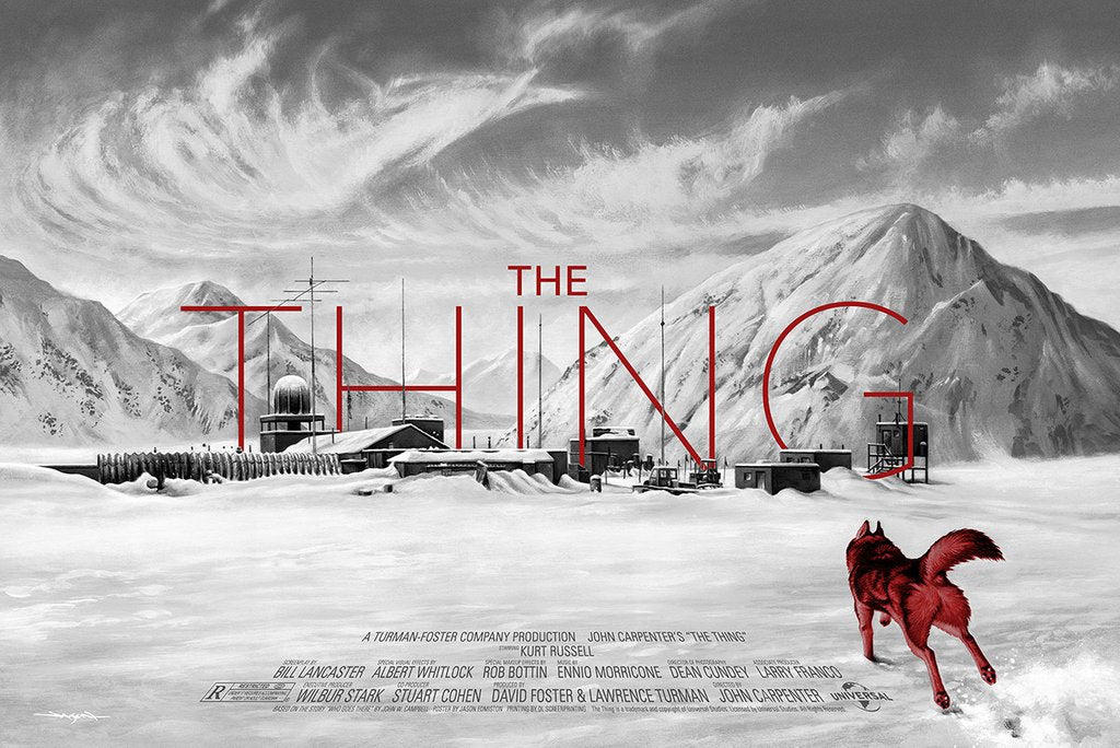
THE THING by Jason Edmiston
We were in deep with THE THING this year. It’s one of my favorite films of all time and became a bit of an obsession while we worked on the board game. Jason’s gorgeous rendering of Outpost 31 is enough to put a huge smile on my face but his surprisingly effective thin geometric title treatment really puts this one over the top.

TRON by Stan & Vince
This poster looks like a remastered deleted scene straight from the film! It’s entirely faithful to the source material while managing to look like something we’ve never seen before. I love the movement lines and the use of the digital environment to frame the action.
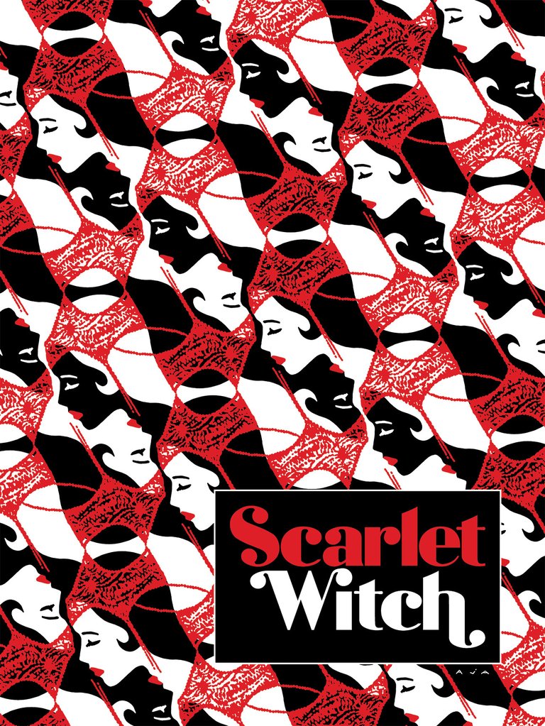
SCARLET WITCH #6 by David Aja
Honestly I don’t know much about Scarlet Witch. I know she was played by the really talented Olsen sister in one of the big Marvel movies but that’s about it. However, as a design nerd, this poster is just wonderful. It’s so bold and delicate at the same time. I’m a big sucker for the red, black and white color scheme and the title treatment is lovely.

SPRING BREAKERS by Cameron Stewart
I love this movie, a lot. I’ve been trying to create a poster for it myself for years. Cameron managed to capture the maniacal joy of James Franco’s “Alien” perfectly here. Weaving Alien’s pink ski-masked soul mates into his Bahama shirt is a great touch. The colors look straight out of a souvenir shop in South Tampa.

SWISS ARMY MAN by Oliver Barrett
This is a film starring a farting corpse. When the setup is that good you go straight for the punchline. Oliver’s a genius.

WIND RIVER by Matt Ryan Tobin
When we assigned this poster to Matt we really didn’t know what to expect. It’s a bleak thriller set in Wyoming and centers around characters going through some extraordinarily grim situations. Not a cakewalk for a poster artist. When Matt sent over this concept we were blown away. Wolves not only play a key role in the film but this animal serves as an excellent metaphor for the story itself. The lone deer wandering into the frozen abyss with such certain fate looming in the distance sums everything up perfectly. I especially like the title treatment on this one.

A NIGHTMARE ON ELM STREET 2: FREDDY’S REVENGE by Mike Saputo
The sequel to Wes Craven’s masterpiece is a great divider amongst horror fans. Some adore it for its mean spirited take on Freddy Krueger and the not subtle out-of-the-closet undertones. Others deny there was even a film between parts 1 and 3. I’m squarely in the former camp. Mike’s poster is gross. It’s really gross. And it’s perfect. Freddy emerging from inside Jesse’s body and shedding the host’s skin is one of the best gore scenes in the entire franchise and sums up the plot of the film nicely.
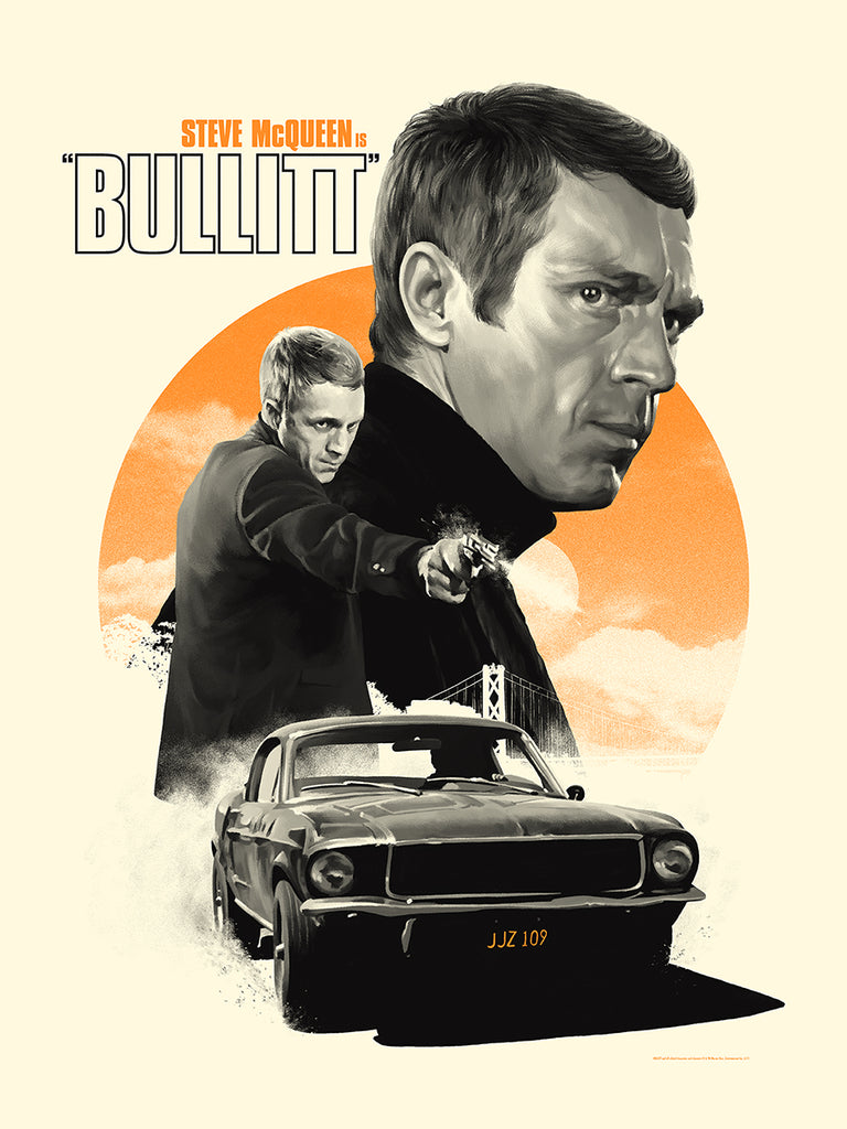
BULLITT by Matthew Woodson
Creating a poster for a 1970s all-or-nothing classic like BULLITT is a tall order. The film, like so many of the era, already has outstanding poster art. Woodson was able to capture the tone of the period here without dipping into goofy nostalgia. His rendering of Steve McQueen is so lush and vibrant without the use of color. Everything about this poster just works.
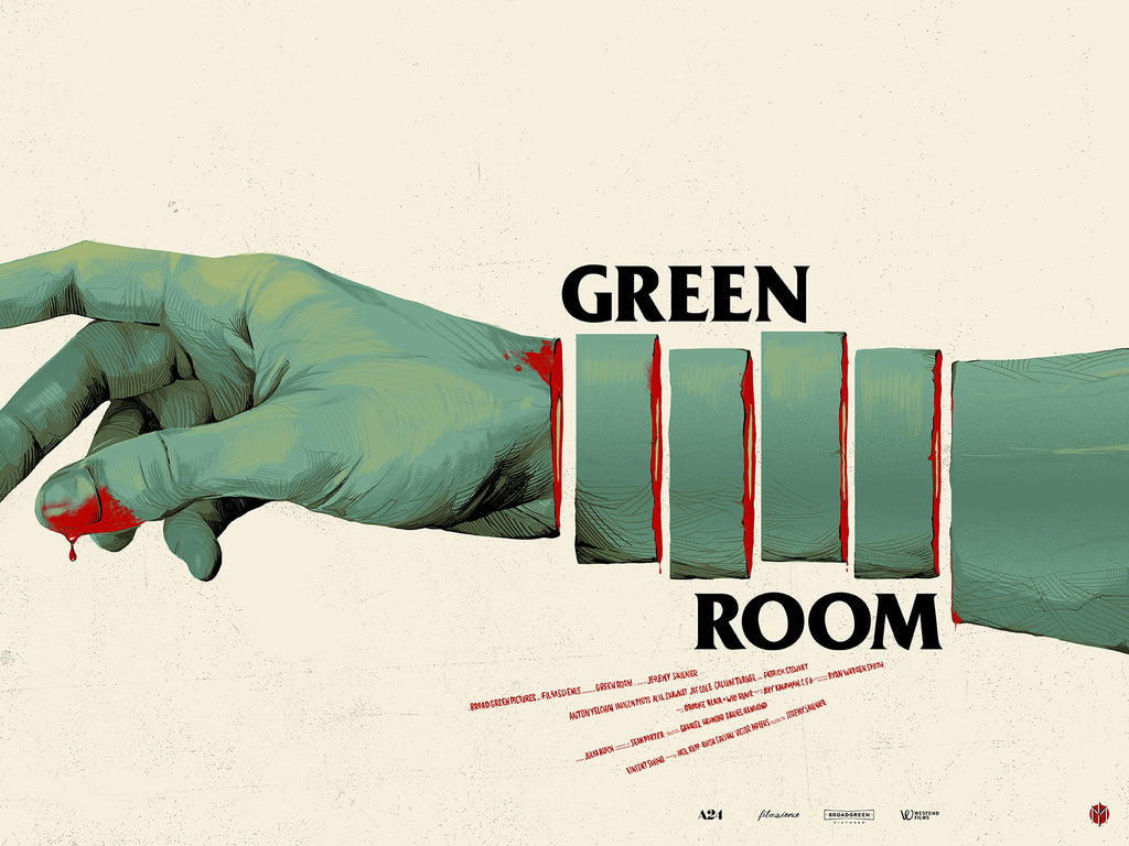
GREEN ROOM by Oliver Barrett
Oliver again. This dude is too smart. GREEN ROOM was one of my favorite films of 2016 and this poster is absolutely perfect. The “flag” in the sliced arm is so tough to look at but such a spot-on design solution.

GOODFELLAS by Marc Aspinall
This poster just kills me. Not only is it wonderfully rendered, it represents what I think is the most important scene in the film. It’s the moment when Karen is completely seduced by the life Henry’s made available to her. She could’ve left right then and there, but she admits, it turned her on. That’s our cue as the audience to turn back now or buckle in for the ride. The quote from the film occupying the billing area in the poster is such a smart touch.