Maniac by Ken Taylor
Mitch often jokes that this poster is a snapshot of Justin taken by the Ghost of Christmas Future, but all I can see is the magnificence of Joe Spinell. While the original poster for "Maniac", hard-on and all, is one of the unbeatable marvels of promotional horror art, Ken Taylor's turn is the poster I've always wanted to see for the film: an image that focuses soley on Joe. Ken always nails a likeness, but what really sets him apart is his delicate ability to convey the emotional essence of a character. I look at this and see a dangerous solitude, a wolf alone in the woods silently suffering a steel trap around its leg, something that evokes both pity and fear in the same stroke. It's even more amazing if you saw the source image which is pretty much a brightly lit photo of Joe wearing a stocking cap, no shadow on his face and nothing really out of the ordinary with his expression. Ken placed the darkness on him all on his own. My favorite poster of the year, and possibly my favorite Mondo poster ever (but I obviously have a soft spot for Joe in the same way Justin has one for Robert Forrester or Mitch for Emile Hirsch).
Dracula by Aaron Horkey & Vania Zouravliov
Generally bringing new talent to Mondo falls under Mitch's aegis, but Vania Zouravliov was a pipe dream I brought up after seeing his spectacular work featured in forum threads praising outstanding pen and ink artists. It took Mitch quite a while to convince Vania to create a poster for Mondo. He finally agreed to take on Tod Browning's "Dracula", but only on the condition that we find someone to work with him to provide a type treatment and layout the text. Mitch mentioned this to Aaron Horkey, a long time admirer of Vania's talent, who leapt at the chance to collaborate. The final haunting gothic masterpiece went beyond all involved parties' expectations. A true case of "the whole is greater than the sum of its parts".
The Mummy by Martin Ansin
I'm really pleased that Martin gave "The Mummy" such a royal treatment as it often seems to get a short shrift amongst the rest of the primary Universal monster movies. None of these films are lacking attention, of course, but I'm happy that it gets a special spotlight with Martin's extensive illustration and attention to detail (even down to rendering plot elements into some of the hieroglyphics accenting the piece). I also have a particular attachment to this poster as it afforded me the opportunity to talk extensively with Ann Foster, the archaeologist I hired to translate the title and credits into authentic Egyptian hieroglyphics. It was super interesting to hear the choices she made to convey the concepts inherent in a film credit block using an ancient language (including some for surnames which could be directly translated rather than conveying them phonetically, like Bramwell Fletcher).
The Texas Chainsaw Massacre by Jeff Proctor
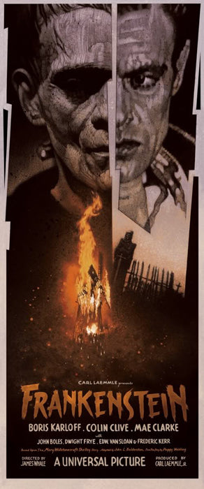
Frankenstein by Drew Struzan
Yeah, this Struzan guy has a future in movie posters if he sticks with it. I'm glad Justin found him.
Bill Hicks by Ken Taylor
Mondo has tried to get permission to do a Bill Hicks print for a long long time, but it just didn't happen as we couldn't get clearance from his family. Super lucked out as Justin happened to be working the store when someone attached to the recent Bill Hicks documentary came in to buy a poster (it might have been Matt Harlock, the director). Justin explained the quandary to him and that Mondo wasn't interested in doing further comedian prints if Bill Hicks couldn't be the next one. This guy interceded and explained the proposal to Bill's family, and the grand result was Ken's excellent portrait of one of my personal heroes.
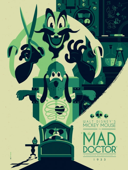
The Mad Doctor by Tom Whalen
Tom Whalen always does excellent work, but this is his stand out piece for us this year. I guess I'm attracted to it because it seems so unlike what you'd expect to find on a poster for a Disney short...until you watch the actual cartoon.
Dawn of the Dead by Jeff Proctor
It's not that I have some mad boner for Proctor, but he happens to be the guy we have assigned on posters for some of my all time favorite films. He always comes through in a big way on them. Dawn of the Dead is no exception. We asked him to do something that felt like the gang poster for "The Warriors" but with every awesome zombie from the film. He put together a great composition that has a kinetic feel hungrily stumbling towards the viewer.
The Raven by Tomer Hanuka
Another gargoyle hewn from the veins of obsidian coursing through the black matter within Tomer Hanuka's skull, and it's pretty.
Hobo With A Shotgun by Jeff Proctor
Just really impressed with how Proctor made such a compelling image out of a blown apart face. That broken palate is a great touch.


