The Fly by We Buy Your Kids
That fucking drip off the finger says so much. For me the image seems to proselytize the viewer with the initial invigorating promise of fly/human DNA conjunction: breaking the arms of bikers, handstands on chairs, and having marathon sex with a member of Mensa. It suggests the sexy dawn of a new existence. Then, true to life, that all fades away until you’re staring at your teeth and penis in a medicine cabinet.

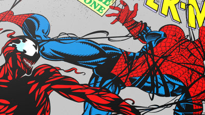
Carnage by Randy Ortiz
I have no connection to or nostalgia for the character of Carnage, but the bloody energy Randy summons here fascinates me. I wanted Randy to make more of these using various licensed characters. Pair them up Street Fighter style into one giant landscape “VS” image: “Ash vs Carnage” or “Venom vs Freddy” or whatever combination you desired. Unfortunately, Randy lost interest after exorcising this dark beauty from his brain.

Fisher King by Sterling Hundley
In my life, I've memorized these blue confines all too well. The real heartbreak of the image comes down to the barely concealed grail just a few boxes away. Proximity doesn’t matter, I guess, as you still have to peer over your box to see it.

Harley Quinn by Matt Taylor
A fun snapshot of Harley’s fanatical ardor. You could mirror this set-up with Squeaky Fromme spinning some Manson wax. However, because it deals in imaginary characters, the tableau appears alluring rather than disconcerting.

The Joker by Jason Edmiston
My favorite of Jason’s three 60’s Batman prints despite my preference of watching Riddler episodes. Jason gracefully captures the campy gleeful mania that comprises Romero’s characterization. As I’ve told Jason repeatedly, I truly feel this is his best executed portrait to date surpassing even my beloved original of Elsa Lanchester.

Heavy Metal by Kilian Eng
I wish I could walk into this poster, pay my nickel and hop on one of those globes. There’s a short animated version of this image produced by the folks at Heavy Metal that only amplifies my longing for it to become a weird reality.

Mood Indigo by Landland
I generally surround myself with visual misery: monsters, demons, and unhappy endings. My experiences led to a pretty poor opinion of what’s out there for the most part. I guess I find the horror familiar and comforting in a strange abusive way. However, every so often a light makes it’s way down the oubliette. Despite the outcome of the actual film, this poster is one of those rare rays celebrating life and love in a manner made spectacular by it’s perceived authenticity. I believe this image is true; it happened to me.

Inside Llewyn Davis by Rich Kelly
I know a lot of folks like Llewyn, bitter and fueling their own moebius strip of failure. You want to shake them and scream, “Just turn around," but in the end you know they probably couldn’t function with the sun on their face. It’s too bright and too warm.

Alice in Wonderland by Ken Taylor
Ken expertly keeps to the character key for the film while still injecting enough “Ken" to make it uniquely his own. The slightly psychadelic palette (which isn’t far from the original marketing materials) brings control to the rendered madness and makes it a cohesive delight. It’s no accident this became the premiere image for the Disney show.

Batman by Martin Ansin
Assign this to 20 other artists, and you’d likely have BAM BANG BONK dotting the compostion. While I applaud Martin’s avoidance of that worn hallmark of the series, I marvel more at the innovative use of the show’s interstitial swirl as a background. It’s a tough kinetic element to render properly, and one you tend to forget being part of Batman’s wild visual tapestry. He deftly interweaves the light shaft from the Bat Signal which directs your eye past the chaos of villainy above and straight to Adam West’s reassuring smile: two beacons placed atop each other.