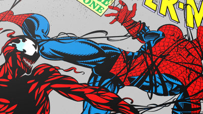
Spider-Man Vs. Doc Ock by Mike Sutfin
This thing is unreal. It’s an image we’ve seen many times in comics over the years, but Mike’s take on it was so detailed and full of energy. It wasn’t just Spidey vs. Doc Ock - it was the stickers on the light pole, it was the genius creator getting into the cab, it was the bird flying away. The poster was so lovingly thought out. Thanks so much for this one, Mike!

Ghost in the Shell
Two of my favorite artists on one of the most respected anime films of all time. I’m cheating and putting both of these on the list as one listing. Why not, right?

Ghost in the Shell by Martin Ansin
Martin’s poster is amazing, but I’m focusing specifically on the foil variant that was released at MondoCon this year (MondoCon 2 info coming soon, btw). When I revealed it on stage after the screening I noticed something that kept going on in the crowd, and when I looked I saw that it was the spotlight bouncing off of the foil and illuminating the crowd. It was THAT BRIGHT. In person, the foil version was probably my overall favorite poster of the year. We only like to use specialty stuff like this when it really makes sense, and it certainly made sense for GHOST IN THE SHELL.

Ghost in the Shell by Kilian Eng
Kilian will probably be on every list of favorite posters that I ever make. He’s one of my favorite living artists and this poster was just so “YES.” It’s that response when you get an email and see something for the first time and you know they nailed it. That was this poster. YES. Kilian just nails it every time. I love his stuff and this was no exception.

The Last of Us by Jay Shaw & Olly Moss
This was one of our first steps into video games and we wanted a fresh take on the imagery for THE LAST OF US. This was originally supposed to be cover art for the vinyl album we’ll be releasing in 2015 and it’s just gorgeous. Seeing it for the first time at SDCC was a treat and the positive response it received made us confident enough to get more video game posters lined up for 2015.

The Sword in the Stone by Rich Kelly
The Disney gallery show was crazy...and out of all of the crazy, this was one of the posters that was at the top of the heap for me. I think Rich also released CAPTAIN AMERICA 2: WINTER SOLDIER around the same time and these are two of his best, for sure.

The Bride of Frankenstein by Mike Mignola
This was a real dream come true. We’ve been wanting to work with Mike Mignola for a long time and 2014 finally saw it become a reality! I loved this poster so much that I snagged the original for it! Just so beautiful - and not to forget the colors by legendary Dave Stewart! So much fun to work on this one with them.

Frankenstein Meets the Wolfman by Elvisdead
This was released at Texas Frightmare Weekend, so when I wasn’t wandering around looking at booths, I was staring at this thing up close. The detail on this is amazing and probably took endless, hand-cramping days to accomplish. Really hoping to get Elvisdead on more for 2015.

Snow White and the Seven Dwarfs by Anne Benjamin
This felt like a poster made in another time. Anne is one of the most exciting artists we’re working with right now and out of all of the amazing work she’s done for us this year, this was just far and away my favorite.

The Black Cauldron by Francesco Francavilla
Francesco! I love this guy so much. Even though he lives in another state, I get to see him every Wednesday at the comic book store through his amazing covers for a ton of different books, week after week. I’m so excited that we get to work with him and when this came in, I think I ran out of room for exclamation points in my response to it. I honestly was worried about it being too dark for Disney and then they gave it the green light! If it’s got monsters, call Francesco!

Forbidden Planet by Laurent Durieux
Such a classy poster for this classic movie by a real class act. I feel like each section of the poster is something you can get lost in. So much of their work is built from hundreds of lines, almost like the entire image was cross hatched. When you look at the detail of the actual mechanics of Robby The Robot and then you switch to “How’d they do that” mode and look at the way he illustrated him. It’s truly amazing.

Batman: Mask of the Phantasm by Phantom City Creative
Batman: The Animated Series and Phantasm obviously have a very distinct style and PCC nailed it, but weren’t a slave to it. They really paid respects to the original style while making it their own poster. I love the tiny Batman on the gauntlet blade. We heard several times from people who worked on the original film that they wished this was the theatrical poster for the film’s original release!
...
Check out more Top 10 posts from Rob Jones, Mitch Putnam & Elijah Wood!


