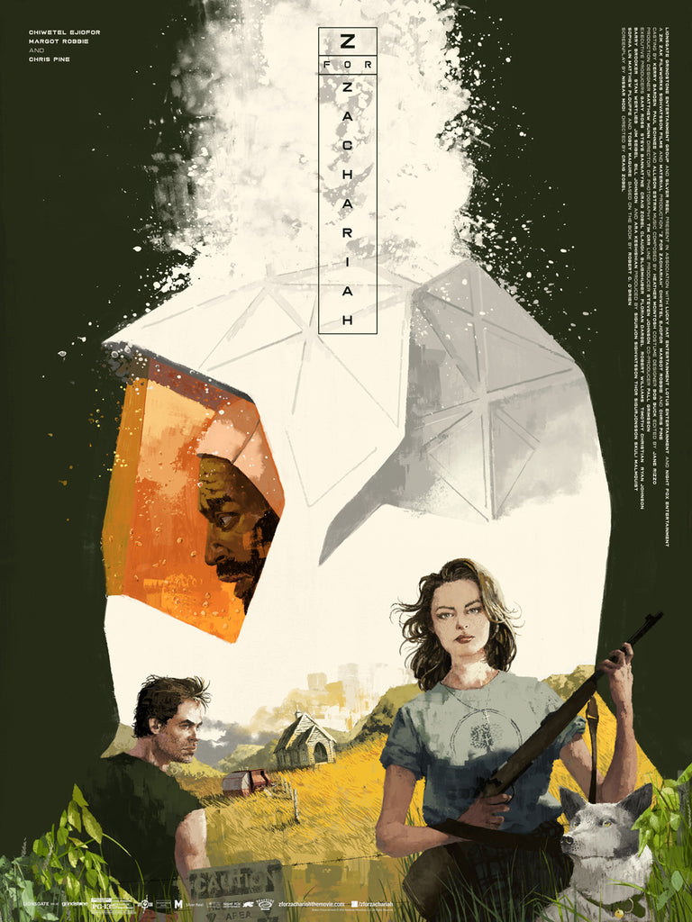
Craig Zobel’s newest film, Z FOR ZACHARIAH, is a character-driven science fiction thriller based on the novel of the same name. It stars Chiwetel Ejiofor, Margot Robbie and Chris Pine as strangers whose lives dangerously intersect in a post apocalyptic “Eden." We loved the film, which opens in theaters this Friday, and were thrilled to team up with Roadside Attractions to create a gorgeous promotional poster by the very talented Marc Aspinall.

Mondo Creative Director Jay Shaw spoke with Z FOR ZACHARIAH director Craig Zobel & Marc Aspinall about the film & poster. You can check out both interviews below.
Hi Craig, thanks for taking the time to discuss “Z For Zachariah” a bit. All of us at Mondo love the film. I’ve read the novel several times. What drew you to the project?
Thanks! I was really drawn to what the film said about relationships. It starts with people dealing with being alone, and becomes a story of people trying to negotiate living in the same space. Then as a relationship develops, the two people trying to do anything to avoid conflict. In terms of the plot, this is because they may be the last two people on Earth—and you don't wanna be in a fight with the last person on Earth—but, I think that dynamic happens in the beginnings of a lot of relationships. However, with only two people you eventually have to communicate, to work out your problems. But once you add another person to that mix, this pressure goes away; all the sudden you can hold secrets, and you can whisper.
Your previous film “Compliance”, while thematically different from “Z For Zachariah”, feels very similar aesthetically. Can you tell us a bit about the overall look of your films?
Well, thanks! With "Compliance," all of the spaces were very small as it essentially revolved around events at a fast food restaurant. Since the spaces were small, we basically just went smaller; tried to find beauty in macro close-ups of an industrial kitchen. After doing that claustrophobic exercise, I was excited to shoot something outside! So with "Z For Zachariah," I was happy to capture nature and more traditional beautiful frames, but we tried to keep a bit of the rhythm of the earlier film regarding types of shots and such...
When we were asked to create this poster we came up with a shortlist of potential artists. Marc Aspinall was ultimately chosen. What was it about his work you felt connected with the film?
I actually was aware of Marc's work, though I didn't know his name at the time. I've always been a big fan of the heyday of commercial illustration—Bob Peak and such—and Marc's work has a flavor of that. I was a fan of the stuff he'd done for The New Yorker and Wired and was excited that he was interested in doing this!
We initially asked Marc for 3 poster ideas. The film is so conceptually rich he turned in over a dozen. How did you narrow down to your ultimate choice?
All of Marc's concepts were exciting. I'd love to say there was some deep reason we went with this, but I think this was just "the most awesomest!"
If you could recommend one science fiction film folks should watch before they see “Z For Zachariah” what would that be?
"On The Beach." "The Quiet Earth." "Five." "Stalker!"

Hey Marc, thanks for taking the time. This is your first time working with Mondo. Can you tell us a bit about your work? Is it primarily editorial illustration?
Hey. Yes, this is indeed my first time with Mondo and what a pleasure it has been. Thanks for having me onboard.
I tend to describe my work as lifestyle driven illustration. Conceptually it can be quite broad, so movies, TV, music, food, through to business and politics. A more representational approach, which never truly treading the realms of semiotics and visual metaphors, instead aiming to depict a concept that is more grounded in reality. Snippets of a moment in time, communicating the brief with composition, and of course the content.
I primarily work in editorial with a whole host of fantastic clients, always challenging me and presenting interesting briefs for me to answer. Subject wise assignments can be quite varied, but I’ve done some of my best work for the reviews section in The New Yorker interpreting some great movies, tv shows, and a few off broadway productions.
I’ve also touched on some fashion - something I’d like to do more of. I had the fantastic opportunity to work for Dunhill Menswear for their ’14 Spring/Summer catalogue, and also did a piece for luxury clothing brand Private White V.C. They were kind enough to have me on the cover, taking up a good deal of print real estate; that was a real treat. Also, recently I’ve had the pleasure of working on web and print imagery for a start-up luxury watch brand.
Your work has a decidedly “golden era” vibe to it. It’s very much in the spirit of Robert McGinnis and Glen Orbik. What attracts you to that school of design?
Firstly, thank you. To be mentioned alongside McGinnis, and Orbik — what a massive compliment for me. I haven’t followed Orbik’s work, but I put Robert McGinnis in my list of Top Five illustrators. I’m hugely influenced by the ‘golden era’ guys and am pleased that comes across.
I find it hard to convey what and why I’m drawn to that school of work. I think, essentially, I love their dedication, their craft and that point in time during the mid-century when they all pushed boundaries and explored what their medium could do. I love seeing the paint marks, the dry brush. Everything visible to us the viewer: the texture, the pencil marks, washes and of course, the highly experimental compositions they were churning out. I think the work was all very human back then, where figures took center stage and their aim was to present their interactions, personalities and stories in new and exciting ways.
That 50/60s body of work presented a new way of thinking for me. I knew exactly what I wanted to achieve once I’d stumbled upon the ‘golden era’ of illustration, and never felt compelled to change styles to match the ever changing trends. Been there before and can be a toxic place to be.

You turned in some really great concepts for this project. What about this film allowed you to come up with such a robust assortment of ideas?
Thanks — and yes — I would not typically send through so many ideas! Usually I’m looking for quality over quantity, as they say. As a rule of thumb, the client will always tend to pick the idea you weren’t quite so keen on, so best to not include a solution you’re not one hundred percent with.
But in this instance, the film presented a lot of visual hooks. Imagery broadly discussing the themes of the film, or simply using the lush landscapes as a starting point...and then maybe juxtapose that with the really interesting preservation suit design and the rather quirky, retro inspired trailer that Loomis pulls along during the film.
The variety of themes offered a great launch-pad: there’s human drama, environmental struggles, religion and, of course, the post apocalyptic undertone that drives the protagonists forwards in their strife. From here, it’s a case of finding the arrangement and general approach that will be the final image. I looked to doing a collage style in a similar vein to Robert McGinnis and Bob Peak’s 60s work. Then an array of singular images - snapshots of fictional scenes looking at symbols and composition, using props that are integral to the film to create new imagery, all hoping to convey the movie without lifting directly from the screen. A visual interpretation of the film as a whole, I suppose.
What are some of the challenges to illustrating human likenesses while maintaining your own personal style?
Getting a person’s likeness alone can be challenging enough. Sometimes it's a small detail - the angle of the nose or maybe the space between the eyes - that can absolutely make or break whether a likeness is achieved. Often for me, because I know who I’m drawing I’ll see their face in my marks even if nobody else sees the same. So constant feedback and troubleshooting is a must.
Translating a likeness with my style...I think it’s dependent on the person, the character they play and their gender, also. My style isn’t super stylized, geometric or far-out; it’s pretty grounded in reality, representational, so it becomes more of an aesthetic, superficial thing. Figuring out a balance in texture and details, that is my main challenge.
Female faces are treated with soft rendering, mostly wash with some light dry brushing. Keep the femininity with wash but not too perfect and smooth; and then maintain that feeling of tactility with the dry brushing.
Guys can vary a lot. Chris Pine started out very rugged - lots of paint built up, dry brush, etc. It came to the feedback and critique stage, and it was clear that the rough stubble he wears in the movie, and his age, that I had gone a little heavy handed; it was all a bit much and a more paired back approach was necessary. I think we achieved a good balance on everyone on the poster. Not without some tweaks and nudges, that’s for sure!
If you could create a poster for any movie ever made, what would it be?
Wow, what a question. I don’t know for sure. Upon reading the question I have Hitchcock's Rear Window or Roman Holiday playing in the back of my mind. Rear Window, fantastic movie with so much to offer visually. A handsome James Stewart and the gorgeous Grace Kelly for starters, and then you’ve got the fantastic setting. The apartment block, the windows into each apartment, with their individual personalities. All great subject matter. Then there’s the dark brooding undertone that sets the viewer up for that fantastically tense build up towards the end. So many possibilities!
Roman holiday. I love this one, gorgeous landscape and architecture, and of course who wouldn’t want to depict a mid-50s Audrey Hepburn?!
Note: the poster by Marc Aspinall will not be for sale. Z for Zachariah opens this Friday! Be sure to check it out.


