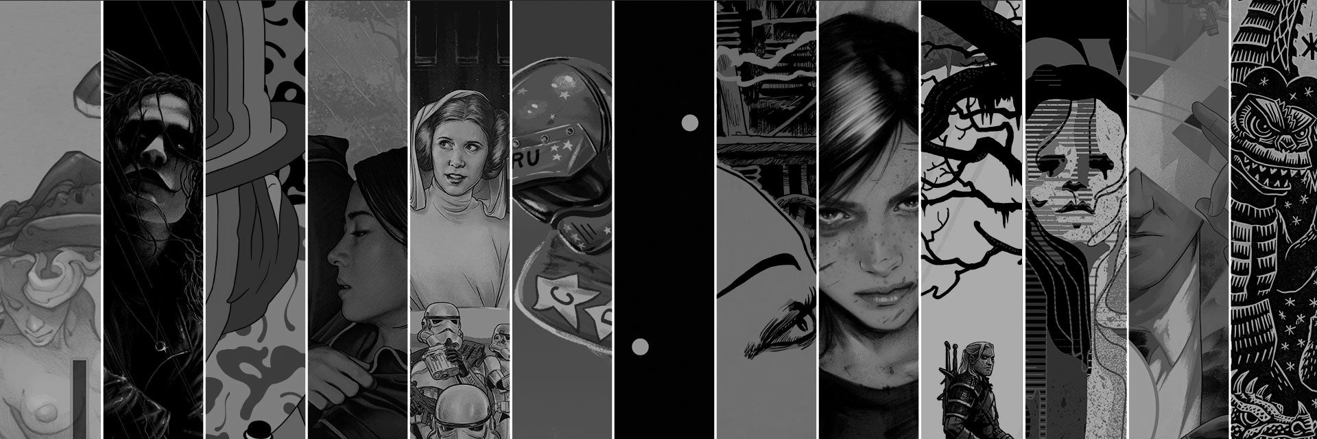
Mitch Putnam's Top 5

RAD by JJ Harrison
This movie was a big part of my childhood, and I can't believe the job JJ did on this. It's so authentically '80s, but also feels so fresh. Truly one of my favorite posters of the year.

HALLOWEEN by We Buy Your Kids
Sonny's concept is really strong here, but let's be honest, it's Biddy's rendering that steals the show. Her patterns and textures continue to evolve, and they always ooze originality. We love these Aussies so much.

"Tree" by Charles Schulz
This 3AM idea of a series has turned into such a joy to work on. A few times per year, I go through years and years of Peanuts strips and pick some of my favorite panels, and it's a ton of fun. In a cold year, this one fills me with so much warmth.

THE WITCHER III by Becky Cloonan
I think I've said this before, but we are so unbelievably lucky to be working with Becky Cloonan. She's the best illustrator, the best writer, the best person, all of it. This one brings all of the things she's wonderfully great at. Miss you, Becky.

The Ways of the Force by Martin Ansin
This is the big one. One of the most ambitious posters we've ever done, Martin worked for what seemed like years to make this one happen. So much energy, so much movement. The master of modern movie posters still doing his thing. Chef's kiss.
Eric Garza's Top 5

THE CROW by Matt Ryan Tobin
This was one of my favorite movies growing up. I just found the character to be innately cool. It should also come as no surprise I was also a gigantic fan of wrestling and "Crow" Sting, so... y'know. I have a type, I guess. Mondo had never done a poster for the film and I'm proud to say that's no longer the case. The direction for this one was simple: make a tribute to Brandon Lee. I'm sure we'll do more posters for this movie that explore other aspects of the film and character, but for this one it was important we pay respect to Brandon and this character he immortalized. Turns out Matty was the perfect hire as he had been auditioning for the job since he was 7 years old (head over to his Instagram feed to see what I'm talking about).

STEAMBOAT WILLIE by JJ Harrison
We put JJ on this poster after being blown away by his first Mickey Mouse pin. Unsurprisingly, JJ knocked us cold off our feet with this poster for Mickey's big debut. It's simultaneously playful and stylish, and feels like it could easily fit as a piece of marketing ephemera for the short back in 1928 as comfortably as it is a new poster nearly 90 years after its release. The goat eating the corner of the poster is next-level mastery.

House of X / Powers of X by Matt Taylor
Is there anything Matt Taylor can't do? Let's just say I'm thankful I'm not a baseball card collector. Anywho... about a year ago, Jonathan Hickman completely revamped Marvel's merry mutants with 12 issues of near-flawless comic book greatness. I remember Matt being in town during the time the books were coming out. Me, Matt, Allie Whalen and Matt Hardeman would come into the office each Wednesday and collectively lose our minds as most of us had either read it by Wednesday morning, or would take a trip to Austin Books to snag the new issue. Yeah, this series holds a special place in my heart. It brought me back to reading comics and I still recommend it anytime anyone is looking for a solid rec. That includes you. Check it out. Matt stepped up and delivered huge with this one. I love how he was able to weave both stories (HOX and POX) into a single poster with the inverted composition. This poster is a masterclass in composition, dynamics, and character balance. To me, my X-Men indeed.


THE LAST OF US PART 2 by Tula Lotay
I love anytime we get to work on a poster for THE LAST OF US. As a huge fan of the games, it's great to collaborate with our friends at Naughty Dog, and it's exciting to see the aesthetics of the game cross-pollinate with an artist we work with. This time around, we handed the reigns to the great Tula Lotay. Tula is in a league of her own and her artwork is a great match for the world of THE LAST OF US. She's amazing at balancing horror and grime with an understated beauty and refinement. She's also incredible at capturing the million subtle emotions in her subjects. The greatness of THE LAST OF US is in how character-driven the stories are. With this project, we wanted to focus on the dichotomy of Ellie and Abby. The best way to go about this, we thought, was to split them into two posters and further lean into the "two sides of the same coin" connection, making them companion pieces in every meaning of the word. Tula took this thought and ran with it to incredible success.

PARASITE by Rory Kurtz
There is so much brilliance at play in Rory Kurtz's posters for PARASITE. It's a masterful display in illustration and rendering, composition, architecture, typography, and colors. Not to mention the success it achieves in capturing the mood and tension of Bong Joon-ho's utter masterpiece. If you haven't seen this film, watch it immediately and then come back and pore over the details Rory put into this poster. A great poster for a perfect film.
Rob Jones' Top 5

BATMAN: THE ANIMATED SERIES “Blind As A Bat” by Phantom City Creative
Honestly only chose this one over other amazing PCC turns as it affords the opportunity to yap about Mary Rose Wiley, our first marketing director.
After Justin Erickson sent in the general idea for the poster a good stretch ago, we asked Mary Rose to have her ma check it over. I honestly figured braille was essentially like code, just letter for letter.
Mary Rose explained: If you want each word capitalized (which I suggest for a title), you need to add a cell before the beginning of each word with the lower right-hand dot. In contracted braille, common words are written as single cells rather than spelling out each letter.
To fully convey the corrections, she sent over the below guide:

I found the idea of braille contractions fascinating and looked them up. One stood out to me: knowledge. It’s a single braille cell with only two dots in vertical alignment. I imagine it represents one person dropping what they know into the head of another person. Let me drop this into your head: Phantom City Creative and BATMAN: THE ANIMATED SERIES are a tip top peanut butter and chocolate combination.

A CLOCKWORK ORANGE by Wylie Beckert
A difficult film to do a poster for. It has to steer clear of appearing to glorify violence. Wylie managed a trick showcasing a completely impotent Alex as a snotty Tantalus taunted by his former sustenance. I feel like I see the pain that threw him out the window more than I see the character which makes it work for me. If I spoiled A CLOCKWORK ORANGE for you there or any Kubrick film for you in the future, then you are at the wrong playground.

A CLOCKWORK ORANGE by Murugiah (Tamil Variant)
Adore this horrorshow pulp warp from Murugiah that includes my living room decor in the corner. Why did we fall so hard for Sharm’s magic? Surprise is the only wavelength that passes through jaded eyes.

THE BRIDE OF FRANKENSTEIN by Francesco Francavilla
Flipped a coin with Garza to see who got to put this on their list. I won. I look at this and the Cure’s “Just Like Heaven” starts playing in the back of my head.

地球攻撃命令 ゴジラ対ガイガン (Godzilla vs Gigan) by Attack Peter
In the kaiju olympics of my mind, Hedorah takes the silver and Gigan gets the bronze. Who gets the gold? Any lucky soul landing one of Peter’s masterpieces. How amazing are they? Everyone acts like they know what Lokta paper is now. If you don’t, then you should tune into his YouTube show and find out. It’s a good mood.
Honorable Mention:
They said to keep it to posters, but...

1. Death’s Whisper: Seance by the Sea by Sara Deck
This planchette mug and the names for the various versions are top drawer all. Yeah, I’ll be putting dead flowers in it. I had a friend who had dead flower arrangements all over her house. Her big quote was, “It’s too much pressure to be a fresh flower.” Her yard looked like shit.

2. THE WIZARD OF OZ - Dorothy pin by Matt Taylor
An emanation of Judy that now often pierces the stripes of my Freddy sweater.


